
In order to adapt to the overseas market and create a product for European and American users, Lark started localization program. By the usability testing, we verified whether the plan meets the user's needs, and defined the direction that can be further improved and explored.
Lark is an office suite which includes instant messaging, Docs, Calendar, and much more. In 2020, we started the Lark localization program. Based on design validation, we pointed out the direction of Lark localization.

After interviews with European and American users, we got the feedback that Lark has a strong Chinese impression. In order to adapt to the overseas market and build a global product, Lark decided to launch its localization plan.

Through user research, almost all interviewers use G Suite / Microsoft Teams/ Slack. They can easily summarize specific characteristics for each brand. Therefore, Lark's opportunity is to establish a unique and strong brand personality that can last in the minds of users.

Lark is an all-in-one product like the competing products. But Lark is cluttered with too many elements, but the competitors has more spacious layout. Lark is lack of dark mode and customize theme function, which all other competitors had. For features, lark has no global search and no chat group functions, which all other competitors had. Besides, competitors has richer and diverse emojis than lark.

So how could we do the lark localization? First we need to know the use insights in China and U.S. I drafted the research and recruiting plan. I also created the user interview test script to understand Lark users' user needs and habits and validate the suggestions given by the design agency.

The search function can significantly improve the user's office efficiency as a core function. However, countless users have reported that this function is useless as our most painful pain point, and they are not sure if it is a global search.

By competitive analysis, I found that slack has a major visual and information architecture change in 2020. They changed the search from top right corner to be global. Microsoft Teams and G Suite also have the same design.

Our suggestion is to redesign search function to be global.

In the Lark newest version updated two weeks ago, we were pleasantly found that they adopted our suggestion to make the search function global.

Instant Message function is Lark's most essential and most commonly used function. In current Lark, the feed stream is information overwhelming, and users rely on the pin method to mark their favorite chat.
Why are the preferences of Chinese and American users so different?
After our analysis, Chinese is more concise, while English is more extended so that the same space can accommodate more Chinese than English. So the left one design can make Chinese users get more information but not cluttered.But American users like the right part design to group chats well and get more spacious layout.So our suggestions is that we needed to combine the advantage of both.

In the latest version of lark, which was launched two weeks ago, we found that they combine the advantages of the two designs as we suggested. They use the tab bar to group the feed, keep the efficiency of information acquisition and make the page less cluttered using group function

We suggested to make user create the calendar from direct message. Users felt that it was more convenient because it they wanted to copy content from the chat box on the left to the calendar, the calendar that appeared on the right was very helpful. Gmail also has the similar function.

Best time available function recommended users the time suitable for everyone, and they could easily pick it up without comparing every guests calendar by themselves.

Through user research, user complained that the homepage is too bright and has low contrast, and it may hurt their eyes if they look at it for a long time.

We made the dark mode for desktop and mobile version which pass the accessibility standards. In usability testing, we found that it improve the readability especially in dar side.

We found that US users tend to customize colors. By the interview, we found that user think every color has its own motions and the prefer blue and green most.
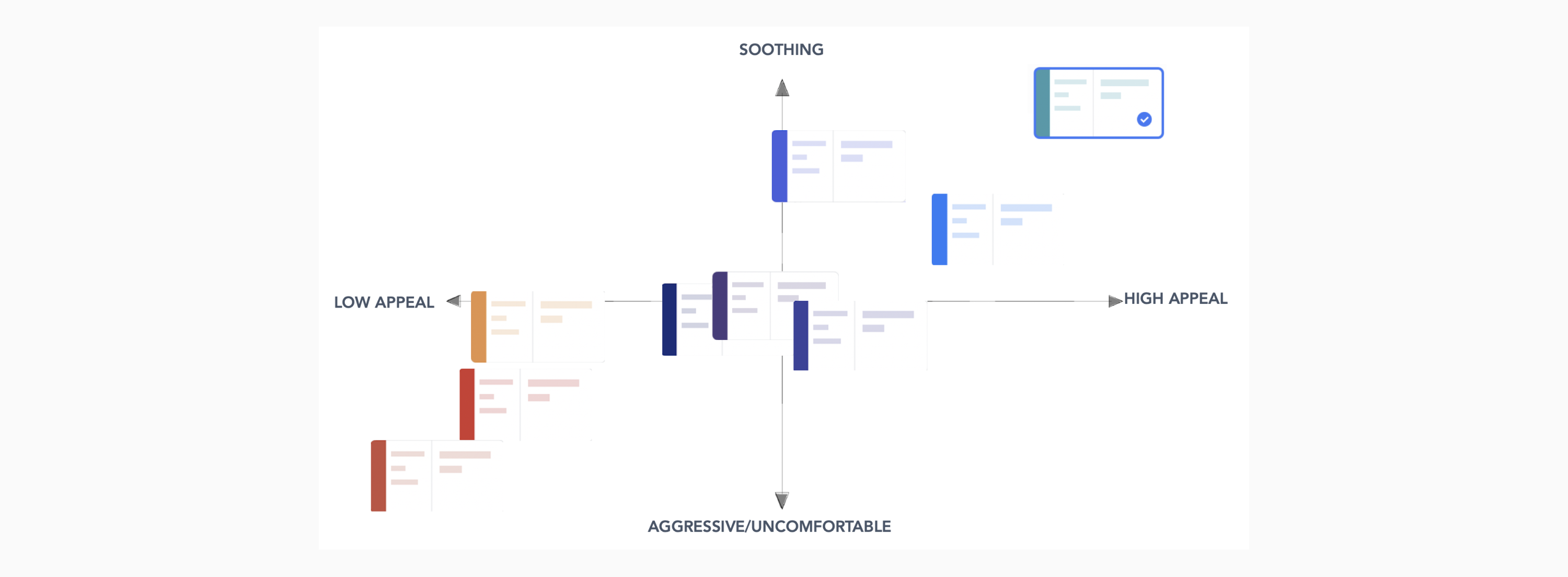
↑ The color theme which users prefer
In response to people's color preferences, we create the customize theme function. It has a positive impact on building a brand image, reflecting its tonality, and enhancing users' understanding of the brand.

.gif)
In Lark’s newest version that went live two weeks ago, we excitedly found that they took our advice and added dark mode and custom themes functions.
.gif)
User complained that current navigation bar icons appear extremely unclear in the feedback. Based on usability testing, we suggested to redesign the navigation bar icons to be clearer with text descriptions on the right design.

After the user clicks on the card, a preview of the document will pop up, and the preview can be opened in the browser. It's a new design feature to make users preview the doc efficiently before they open it.

There is a big difference between China and U.S. for SUS score. China’s SUS is rated as C+, and the U.S. is rated as B+.
China & U.S. User habit
-The overall usage habits of American users are still biased towards Slack's existing flow. Many users in the U.S. suggested that some of the functions of Agency are similar to slack and Teams, so they get used to it.
-Chinese users believe that existing feeds are sufficient to meet the needs of group management; while American users generally believe that existing feeds cause confusion in chat management, and Agency's new feed design helps a lot.
Cultural Difference
China is a single nation, while U.S. advocates pluralism. U.S. users hope to have more emojis with more skin tones, especially black, Asian, white and other skin tones, so that they can express themselves. Many users mentioned that there are more than 10 times more emoji in slack than us, and hope to continue rich.

• After usability testing, the new design provides a powerful design solutions for the next step for Lark.
• Brought the increased NPS and SUS score for the users.
• Presented to the vice president of ByteDance and got highly praised.

What inspires me most in this project?
Localization is not just a simple translation of language. We need to think about user habits, work habits, market propositions, and culture gaps. Based on that, we can do a real job.
What did I learn from the project?
By user research, I accurately capture Chinese and American users' needs. I proposed the design direction of lark, and the newest version followed our direction and went online. As a former Lark designer, I feel very proud of it. I also introduced the SUS method, and it became the most convincing proof to show users' opinions.
Where should I improve?
It was challenging to manage a design agency because of the work style and time gab. So I didn't focus on the details but made a timeline for critical outputs and kept everyone on the same page. I gave the agency the freedom to make decisions but oversee the whole direction. It also improved my management skills.


