
Smart Notification can help real estate, administrative, and IT personnel to send notifications to all employees at ByteDance. It is a web application using AI-driven technology and is embedded in the workbench of Lark Office Suite.
In 2021, we designed Smart Notification product from 0 to 1 in 5 months. This product helps real estate, administrative, and IT personnel to send notifications to all employees at ByteDance smartly, efficiently and accurately.

After user research, I entered the design exploration stage. In 7 months of work, I designed 3 functional modules, 20+ pages and 6 prototypes to iterate my design. In this case study, I will focus on how I solve the problems above.

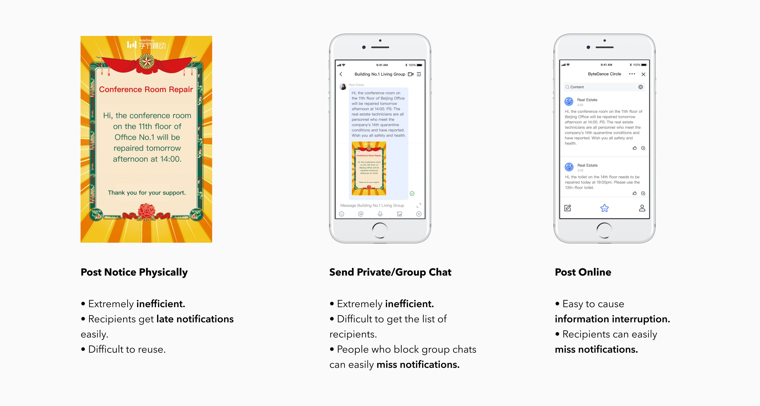
Our target users are real estate, administrative and IT personnel of ByteDance. They need to send internal employees notifications like water and power outages, elevator repair, fire notification, welfare gifts distribution and so on. But they don’t have a unified way to notify employees efficiently.

We found that users send notifications through three methods: posting notices, send private chat/group chat/moments, but these methods can not meet user's expectations.
We sent 367 questionnaires to target users and got 205 valid feedbacks (conversion rate: 57.4%). Besides, we interviewed 18 users from real estate, administrative and IT department.

By user research, we found a lot of insights and we used journey map and affinity map to analyze their insights. Beside, we had a meeting with PM and front-end to make sure the key problems the product need to solve and decide the direction of the product.

Based on our findings, I made the brainstorm with PM and ideated the functions that users need. After that I build the information architecture to explore the functions.

We created smart notification to help users send notification efficiently. The first step for users to send notifications is to create new events. We have tried a variety of information architectures for the presentation of the notification form.


Before - Create New Events
Page 1 Cons:
The important categories are missing and existing categories can not meet the complex needs of user.
Page 2/3 Cons:
Users confuse about [Event time/Location] and [ Notification Time/Location] and fill in the wrong place easily.


After - Create New Events
Solutions:
Use pagination form to divide the creation process
Pros:
1. Rich categories meet user’s sending needs.
2. Successfully avoids users from filling in errors.
Based on user interviews, we found that when editing an event, what users most want to see is the appearance of the notification displayed on the recipient’s phone. Based on this strong user demand, we decided to adopt a WYSIWYG style to design this function.
Edit Events Page
User Needs:
Based on the interview, what users want to see most is the appearance of the notification displayed on the recipient's phone after sending it.


Before-Preview notification while editing
Page 1 Cons:
3D mobile phones appearing on a 2D plane are very abrupt.
Page 2 Cons:
Card mode is difficult to associate with a mobile screen.
Page 3 Cons:
The front-end is hard to implement.

After - Preview notification while editing
Solutions:
Made what users see is what recipients get.
Pros:
1. 2D message is not obtrusive on the 2D interface.
2. Text messages is easily reminiscent of mobile phones.
3. Easy to implement for the front-end.
Based on user research, due to employee resignation and other reasons, users often do not have an exact user list and do not know who should be sent to, and the existing notification methods are difficult to cover employees who come for business trips or short-term work.
By Usability Testing
We conducted usability tests for 6 users, who came from the real estate, administrative, and IT departments. Based on that, we found that the staff can be divided into two groups. They have different backgrounds and need to receive different notifications.


Before - AI Smart List
Solutions:
Make users just send and AI will help them target who should receive it based on the event location and time they picked.
Cons:
1. Confused about the reasons for AI recommendations.
2. Hope to adjust the list by themselves.

After - AI Smart List
Solutions:
Show smart list using data visualization.
Pros:
1. Explain AI recommendation reason to dispel user doubts.
2. Visualize the proportion and details of AI list to let users send with confidence.
3. Give users freedom to choose AI list to increase user's control.
Through user research, we found that users needs to check past notifications for reference. Therefore, our homepage is designed as a notification lists to facilitate users to manage past notifications.

Before - Notification Lists
Cons:
1. Confused about whether the search is global.
2. Need to adjust daily notifications frequency to prevent disturbance to recipients.
3. Need to see more notifications on a single page.
4. Status colors don’t pass the accessibility contrast ratio.

After - Notification Lists
Pros:
1. Put the search bar on the top to indicate it globally.
2. Use a line chart to display trends of daily notifications to help users adjust sending frequency to avoid disturbing.
3. Remove space between the table to show more notifications on one page.
4. Redesign status interface to make it clean and clear, which also meets accessibility AA standard.
• Seamless Design: This product is integrated into Lark so we try to make the user feel seamless when they switch from Lark.
• Edge Case Design: Except success delivery status, we need to consider edge cases like failure delivery and unread status, which influence user's experience seriously.
• End-to-End Design: Except designing for desktop application, we also design how the message looks like on the user's phone and recipient's phone, which fits end-to-end design.

• For senders: Improves work efficiency and saves time to send notifications.
• For recipients: Avoid information interruption successfully.
• Usability Testing: 75 Grade B SUS score and Passive NPS score.

On 07/21/2021, a flood disaster broke out in central China’s Henan Province. Our SOS team from administrative department sent out more than 6,000 notifications within 20 minutes, asking employees to reply whether they were safe and save employees who needed help. We covered 100% ByteDance employees in Zhengzhou and improved the sending efficiency by 200% using AI. As a designer, I am proud that the product I design can be applied to real life and help the company ensure the safety of more employees. It also helped the company save the time, create more value and save more employees.

• Work with PM
70% Design and 30% Product Management. Build the PRD with PM together and evaluate the project timeline and priority.
• Work with Engineers
During WFH, regular product meetings will be held twice a week. All parties (design, product, R&D) will jointly conduct a design review, and the design will be iterated according to requirements. Perform gray-scale testing together with development, and use Agile Management/Jira to conduct walkthroughs, which reduces communication costs and improves cooperation efficiency.
• User-Centric
Always speak for users rather than imagination. Take user research seriously because all designs come from this.
• Redesign Part
I will modify the save as a draft manually to the automatically save, which not only improves user's efficiency but also gives users security and prevents user data loss.
• Limitations
Initially, the front-end was not involved as early as possible. Due to implement problems and time issues, some important functions such as dashboard and one-key resend function was not launched for Phase 1. The front-end should be involved early to better understand the product logic and will make development smoother.

